

How to Make Your Mac Screen More Comfortable to Look At
Comfort Isn’t One Setting — It’s a Combination
If you’ve ever thought “something about this screen feels off” without being able to name it, you’re not alone. Screen discomfort is rarely caused by one obvious problem. It’s usually a mismatch between several settings at once — brightness, contrast, color temperature, and saturation — and the room you’re actually sitting in.
Turning brightness down a notch might help a little. But real comfort comes from tuning all four variables together, and adjusting them as your environment and task change throughout the day.
The Four Variables That Determine Screen Comfort
Brightness Relative to Your Room
A screen brightness that’s perfect at your bright desk by the window will feel harsh once the sun goes down. Comfort isn’t about a fixed brightness number — it’s about how your screen compares to the light around it.
Color Temperature
Cooler, bluer light keeps you alert — useful in the morning, less useful at 10pm when you’re trying to wind down. Warmer tones feel gentler on the eyes for extended sessions, especially at night.
Contrast
Too little contrast makes text feel washed out and hard to focus on. Too much contrast — especially in dark mode with pure white text — can create a glare effect that tires your eyes faster during long reading sessions.
Saturation
Highly saturated colors can feel visually loud over time, particularly during long work or reading sessions. Slightly reduced saturation tends to feel calmer for extended use.
Matching Your Screen to the Time of Day
- Morning — brighter, cooler tones to help you feel alert and focused
- Midday — brightness matched to ambient light, neutral color temperature
- Evening — warmer, dimmer settings that ease the transition to winding down
Matching Your Screen to the Task
- Coding or writing — slightly higher contrast for text clarity
- Reading — softer contrast and warmer tones to reduce fatigue over long sessions
- Photo or video work — accurate, neutral color reproduction
- Meetings and browsing — balanced, unremarkable defaults that don’t call attention to themselves
Why Built-In Mac Settings Fall Short
macOS gives you a brightness slider, True Tone, and Night Shift. That’s genuinely useful — but it’s three separate, mostly independent controls, none of which adjust automatically for what you’re doing or how the room looks at 9pm versus 9am. True Tone reacts to ambient light but doesn’t touch contrast or saturation. Night Shift only shifts color temperature on a timer.
None of them let you save a “reading” setup and switch to it with one click.
Watch It In Action
A Simple Comfort Routine to Try Today
- Start with a preset close to your current task — work, reading, studying, or wind down
- Nudge brightness to match your room, not a fixed number you set once and forget
- Warm up the color temperature if it’s evening or you’re prone to eye fatigue
- Save it so switching back later is one click, not four sliders
How to Get Started
Step 1: Download from the Mac App Store
Download Goodmood — Free on Mac App Store
Step 2: Open the preset gallery
Try a preset for whatever you’re doing right now — work, reading, or winding down.
Step 3: Customize if needed
Adjust color temperature, brightness, contrast, or saturation in real time until it feels right, then save it as your own preset.
Step 4: Switch as your day changes
One click to move from “focused coding” to “evening wind down” — no re-tuning from scratch.
Frequently Asked Questions
What is the most comfortable brightness for a Mac screen? There isn’t a universal number — comfortable brightness is relative to the room you’re in. A good gut check: if your screen looks like it’s glowing or you can see a strong reflection of it in a dark room, it’s too bright. If you’re squinting or leaning in to read text in a bright room, it’s too dim.
Should I use warm or cool colors on my screen? Cooler tones tend to feel more alert and are better suited for mornings or tasks requiring focus. Warmer tones are gentler on the eyes and better suited for evenings, reading, or long sessions where fatigue builds up.
Does screen contrast affect eye comfort? Yes. Too little contrast makes text harder to focus on; too much — especially bright white text on pure black — can create a glare-like effect over long sessions. Moderate, task-appropriate contrast is generally more comfortable than either extreme.
Is True Tone enough for screen comfort? True Tone helps by adjusting color temperature to match ambient light, but it doesn’t touch brightness, contrast, or saturation. It’s one piece of the comfort picture, not the whole solution.
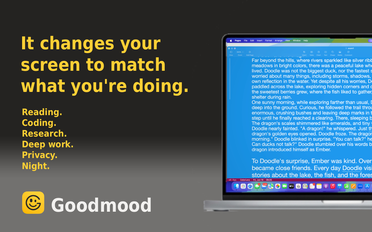
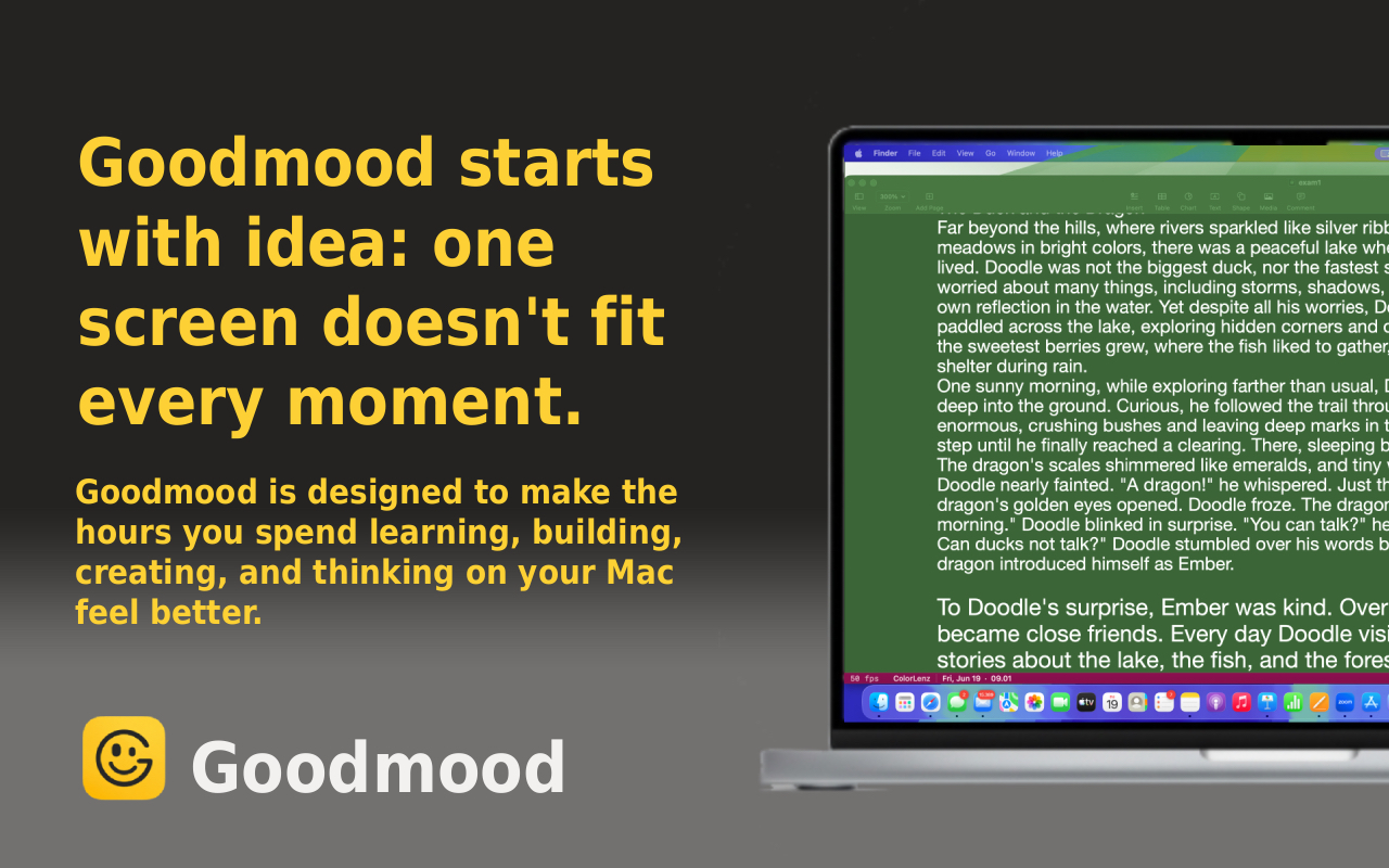
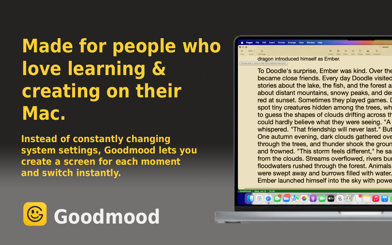
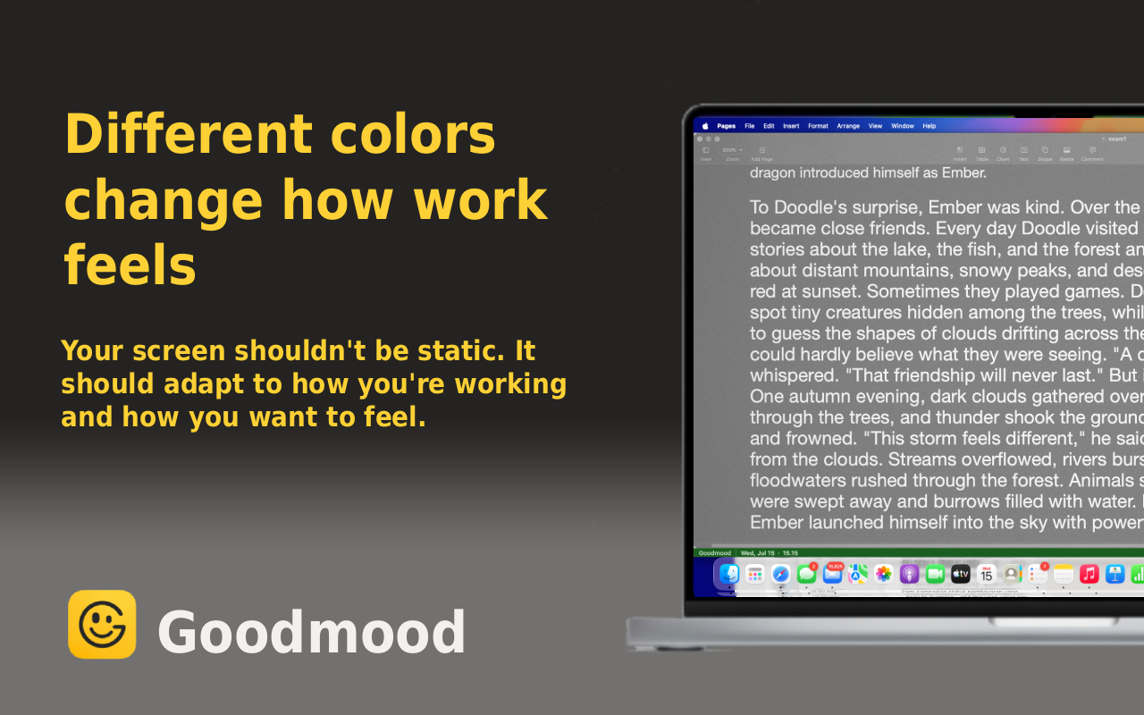
Discover Goodmood - Screen Companion
Related Articles
- Why Your Eye Drops Aren’t Working (And What Actually Helps)
- 3 Better Alternatives to Blue Light Glasses for Digital Eye Strain
- Can You Eat Your Way to Better Dry Eyes?
Ready to make your screen easier to live with? Watch the video above, then try it yourself.